Field notes
Reading session fill without vanity averages
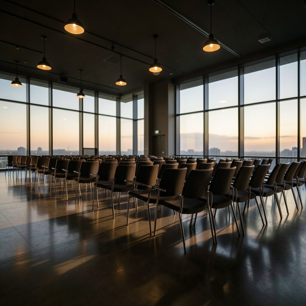
A single fill percentage for a keynote hall can look healthy while the last three rows stayed empty for half the talk. Organizers who only report the peak count miss when people left after the first panelist and never returned.
Start with a time series at fifteen-minute intervals if your badge or door count allows it. Plot the curve against the programme clock so you can see whether the drop matches a competing session, a coffee break, or simply a talk that ran long.
When comparing halls, normalize by seated capacity rather than by registration size. A 90-seat room at 70% fill can matter more to a programming lead than a 500-seat hall that looked busy from the aisle.
Share the curve with speakers only when it helps them improve pacing. The useful story for an organizer is which slots consistently lose attention, not which individual left early.